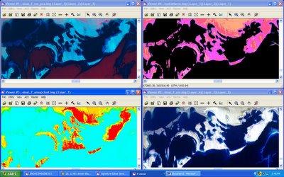
So here we have a little look into my world of disguised statistics. The screen shot is from today when I got really bored and frustrated. This is a comparison of four images that are completely different, but all of the same place.
First off this is a Landsat 7 ETM+ image. The bottom right image is represented in near true color, so that’s what the little islands off the Saudi coast in the Red Sea actually look like. This image has been resolution merged with the other 7 bands to spatially enhance it, meaning that the original pixel was about 30m across and is now four 15m pixels, respectively.
The bottom left image is an unsupervised classification of the same, producing a thematic visual, each color represents a similar reflectance value throughout the electromagnetic spectrum. Obviously water is a teal color, shallow water or submarine mud is greenish red is some type of dry surface.
The top right is a Hydrothermal Index or band ratio. Essentially multiplying and dividing one band against another. This shows a clear difference between water and non-water, or black and not black, and radiant bodies which are colored.
The top left and last one is a Principal Components Analysis rendering of the same place. This is a method of compression which reduces the redundant data and brings out the uncorrelated information. The first band or Principal Component represents Intensity, or brightness of the scene. Water is not very bright and actually a great absorber as in the image it is very dark in the blue, PC-1. I think the red might have something to do with either sediment or depth, because the depth increases to the lower section and so does the redness. But it might be a simple change in brightness as well after looking at the original.
I am way behind in my actual work, so peace out, like rainbow trout!

No comments:
Post a Comment